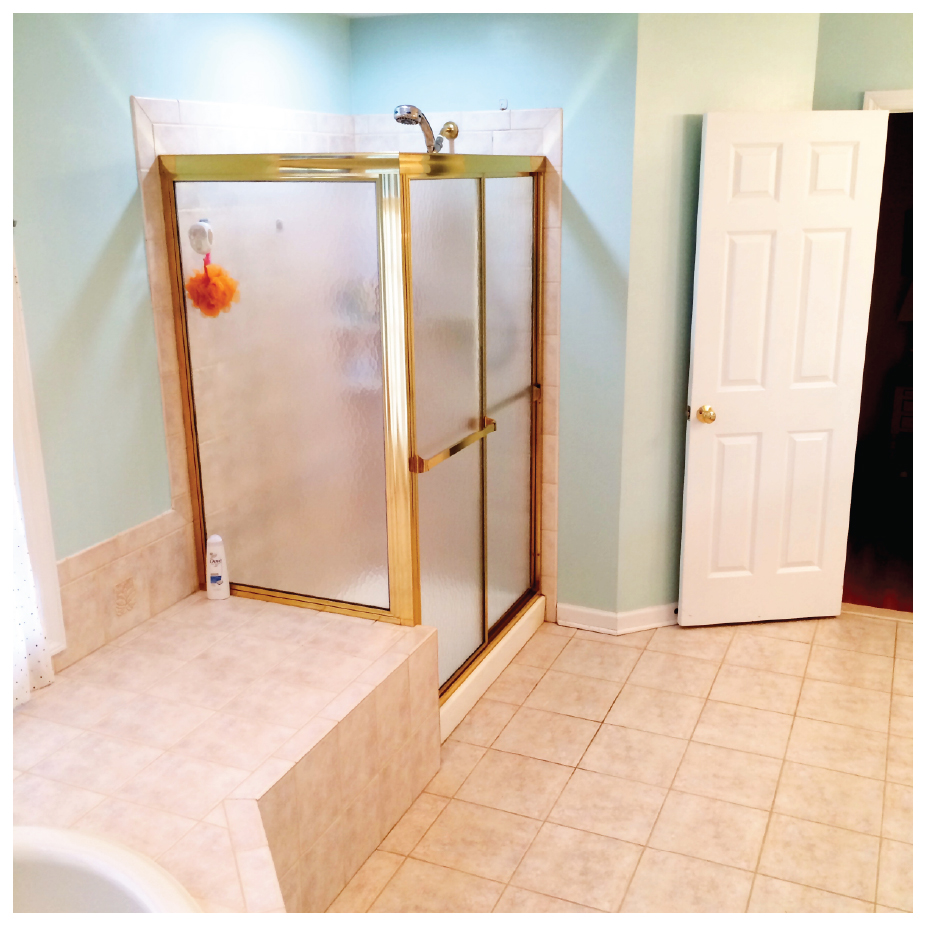
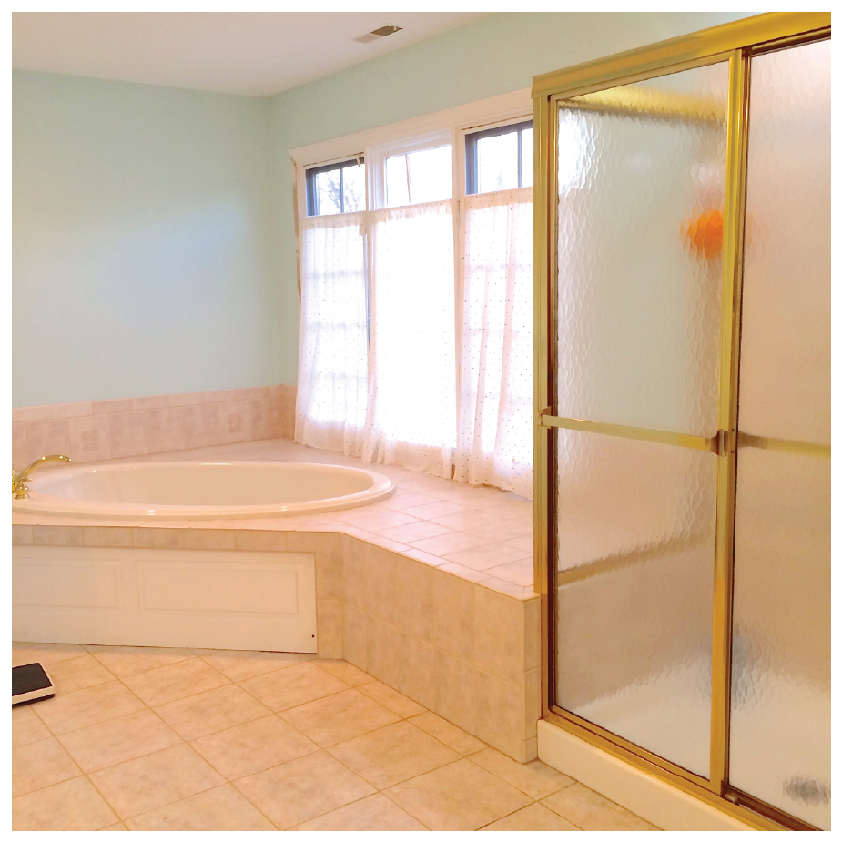
December 26, 2013 my primary bathroom was a shining example of the styling from 1998. Brass everywhere. A huge corner jetted tub (cream, of course) took up most of the space and made opening the windows nearly impossible. The large square tiles were speckled shades of tan and matched the tiles in our kids' bathroom at the time. The first owners probably saved a little money by selecting one style of tile. Everything was working, technically, but in terms of reflecting my personal taste, the room was way off the mark. It was time for a change.
I knew what I wanted my bathroom to look like, and what fixtures I wanted. In my mind's eye, I had completely reworked the room. I gave my contractor the link to my Pinterest boards, and this proved to be very valuable.
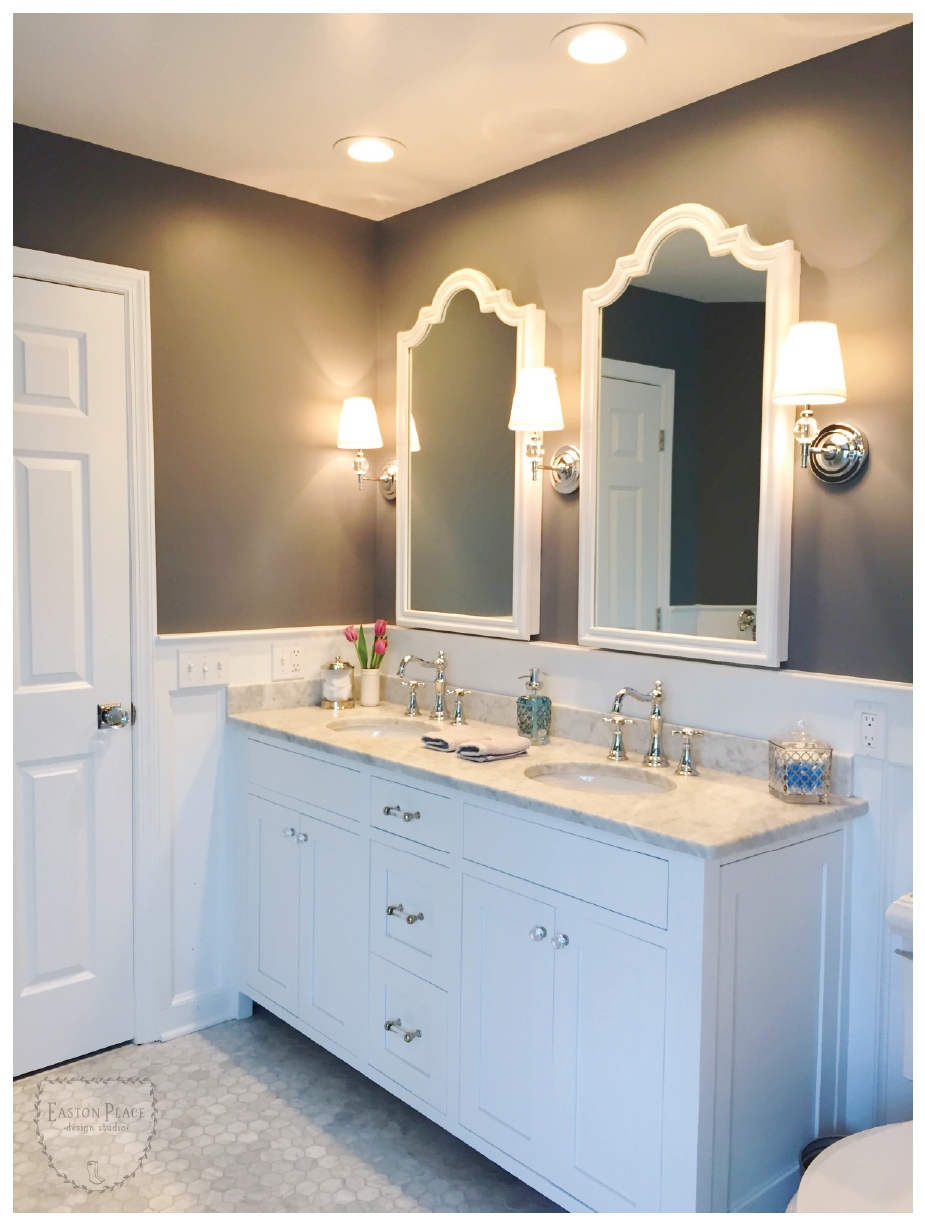
mirror: WHITBY MEDICINE CABINET by Restoration Hardware (RH). crystal ball wall sconces: WILSHIRE SINGLE SCONCE by RH. pulls, knobs, hooks and town bar: VINTAGE by RH. tub & loo: MEMOIRS by Kohler. faucets: WEYMOUTH by Moen. paint: WHITE DIAMOND and ROCK GRAY by Benjamin Moore
I have to admit, I was so happy to see all of that brass and tan leave the house. And the new double-hung windows made such a difference! I'm so excited to share the before, during, and after photos of the space. I absolutely love my new bathroom.


